What’s the first question you ask yourself when you set out to design a landing page? As a loyal reader of the Invesp blog, you’ll know that designing landing pages to optimize conversions starts with … the conversion goal. It’s fairly simple; you want conversions, so start there.
So that first question is: “what action do I want the visitor to take on this page?”
The Clash Between Your Goal and the Customer’s Goal
Tragically, the simplicity of landing page design diminishes exponentially after that first easy step of choosing a conversion goal.
Here’s an example: you decide to set up a lead generation landing page to get more sign-ups for your newsletter. You’ll need a form to collect the data. After that, you need to answer some questions to determine how the page will take shape. Questions like:
- What customer info do you want to get?
- What content, including copy, images and graphics do you want to include?
- While you have them on the page, do you want to let them know about your specials, promotions or any other info?
But, using questions like those as the basis for your landing page design puts your goals on an inescapable collision course with your customer’s goals. And your conversion rates get badly trashed in the crash.
If you want to put the simplicity back into landing page design, and a boost into your conversion rates, the page can’t be built around what you want. You’re already a convert. But your web visitor isn’t. So you need to answer questions like:
- How will the customer perceive the page?
- What do they want in return for their information?
- Will distracting them with other options reduce their chance of converting?
See what happened there? You can’t have a crash of goals if yours are in line with the customers. When you design your landing page through the customer’s eyes, not only do your goals magically align with theirs, you return the simplicity to the page design process. Everything falls into place. You know what information to ask for, what content to develop and what elements to use.
Customer-Centric Guidelines for Higher-Converting Landing Pages
While every visitor is different, you can use some basic guidelines to put your landing page design in the right frame of mind: your customers’.
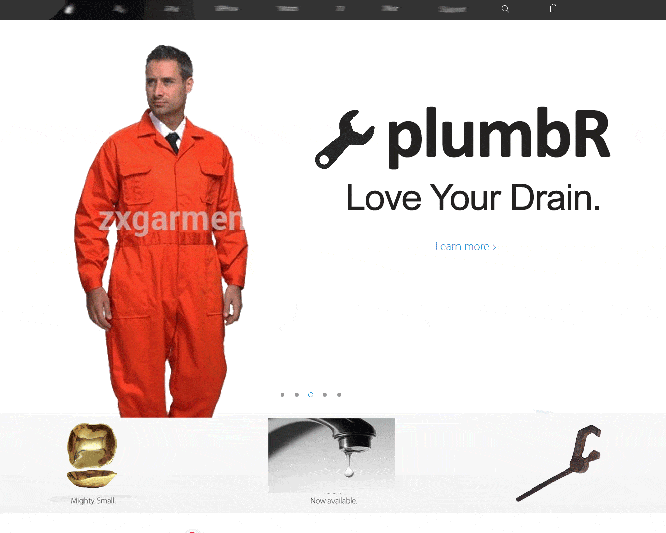
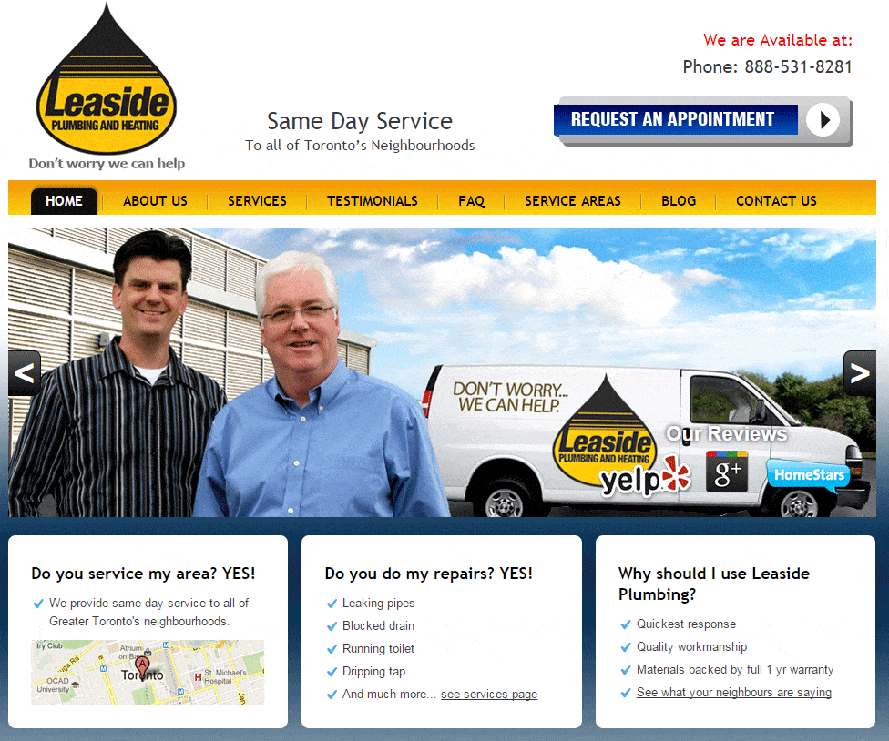
1. Don’t Design for Design’s Sake – If I had a dollar for every time a client came to me and said he wants his site to look like Apple.com, I’d be writing this post from a villa in Tuscany.
To get the customer to take your call-to-action (CTA) and convert, the entire page must focus on solving the questions and concerns he might have before doing so. The overall look of your page is the first indication your customer gets that he is in the right place. If the graphic design and layout don’t fall in line with his expectations and needs, it can be the first step towards a bounce.
Don’t design for design’s sake; design for your customer’s sake.
Take a look at the two pages below. One is an Apple-inspired mock-up by your design-challenged author, the other an actual webpage that does the job without a fancy design. Which plumber would you choose?
2. Create a Cognitive Progression – Every web searcher is on a journey of discovery. From the moment they begin, they are unsure of what search terms to use, what to expect from the results they get and most often they’re unsure of exactly what they want.
Your customer has either clicked a search result, advertising message or link to land on your page. They have taken the first step in their journey. They have momentum towards conversion.
Starting with its headline, which needs to reflect the search term or advertising copy that got the customer to click on your link, your page must maintain and build on the momentum that started with the customer’s click.
You must keep giving the customer the next logical step in their journey of discovery; the journey that leads to them taking your call to action.
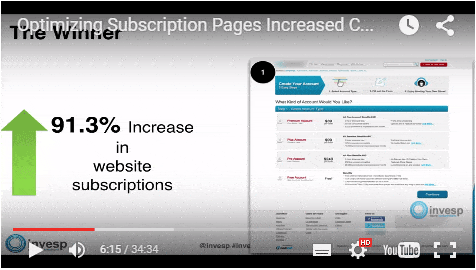
In so doing, you create a natural cognitive progression for the customer that he finds difficult to deny. Check out the recording of this Invesp webinar to find out how attention to cognitive progression paid of with a 90% increase in conversion rates.
3. Will That Be One Goal or Two? The accepted online wisdom is that your landing page must focus on a single conversion goal. It’s based on the well-documented principle that too much choice can cause consumer paralysis and result in no choice at all.
But to blindly accept that every landing page must have a single conversion goal at the exclusion of all others can be a mistake. Depending on where your landing page falls in your customer’s buying cycle, more than one call-to-action could be in order.
The Buying Cycle – You can create different landing pages for customers at different points in the buying cycle. If your page is designed for those who are ready to buy, then it would be foolish to offer them any other option than to buy.
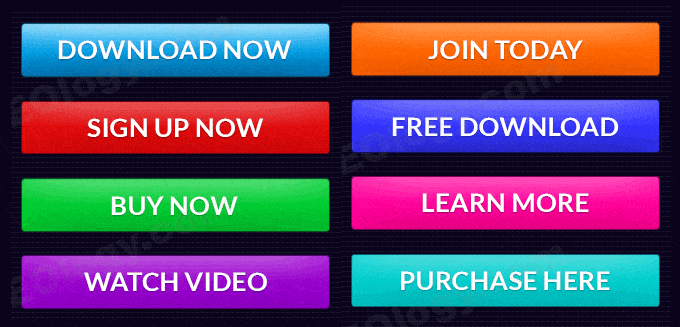
But if they are at the beginning of the buying cycle, where they are interested, but need more information before making a purchase decision, they might want to “Learn More” or “See a Video”.
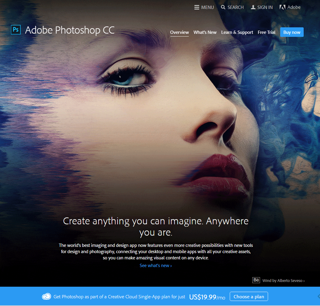
On the landing page below for Adobe Photoshop, while ‘Buy Now” is the most distinctive call-to-action, the page actually has something for people at every stage of the buying cycle (using the good ol’ AIDA model):
a) Awareness/Interest – The page is actually the “Overview” page for Photoshop
b) Desire – Those already familiar with Photoshop are invited to “See What’s New >”
c) Action – If you’re ready the pull the trigger, you can “Buy Now” or “Choose a Plan”.
But the landing page after you choose “Buy Now” gives you little choice but to buy and all the assistance you need to do so.
4. Create Value-Appropriate Forms – For lead generating pages, the “sign-up” form is a critical element for conversions. If the form doesn’t work, neither will its CTA.
Customers are increasingly jaded by the constant online demands to give away their personal information.
Your forms will convert at a higher rate if the information you ask for corresponds to the value the customer believes he will get by giving it.
It’s tempting to grab all the data you can while you have the customer on the form; but ask too much and you increase the risk of getting nothing.
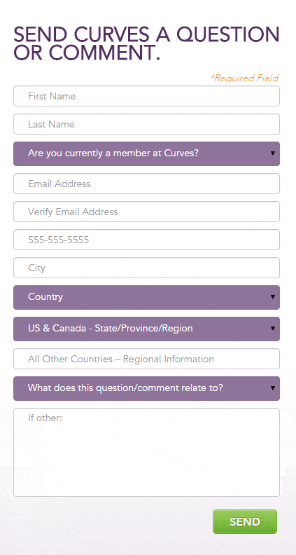
Take a look at how much information Curves wants just for the privilege of asking them a question. No answer Curves could give would justify sacrificing this much personal information.
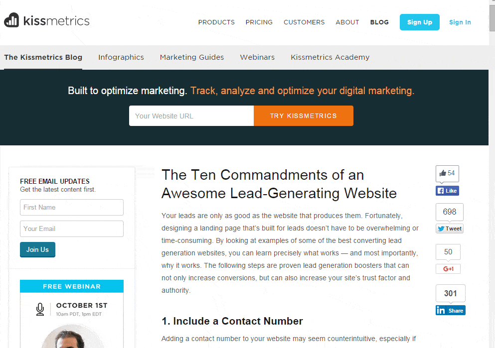
Conversely, Kissmetrics uses a simple two field form to sign up for their email list. And they outline lots of benefits that come from filling it in.
The first field asks only for a first name. That seems reasonable and harmless in exchange for “Free Updates” and a chance to get the “latest content first”. The second field asks for an email address – which is only natural if you’re signing up for email updates.
5. The Call To Action – This is it. This is what your entire landing page is all about. It’s where the customer converts.
That burden means you can’t pay too much attention to your CTA or test too many different versions.
To develop your highest converting CTA, start with the following guidelines and take it from there:
a) Make Your CTA Distinct – If the customer can’t quickly identify your call, they can’t be blamed for not taking it.
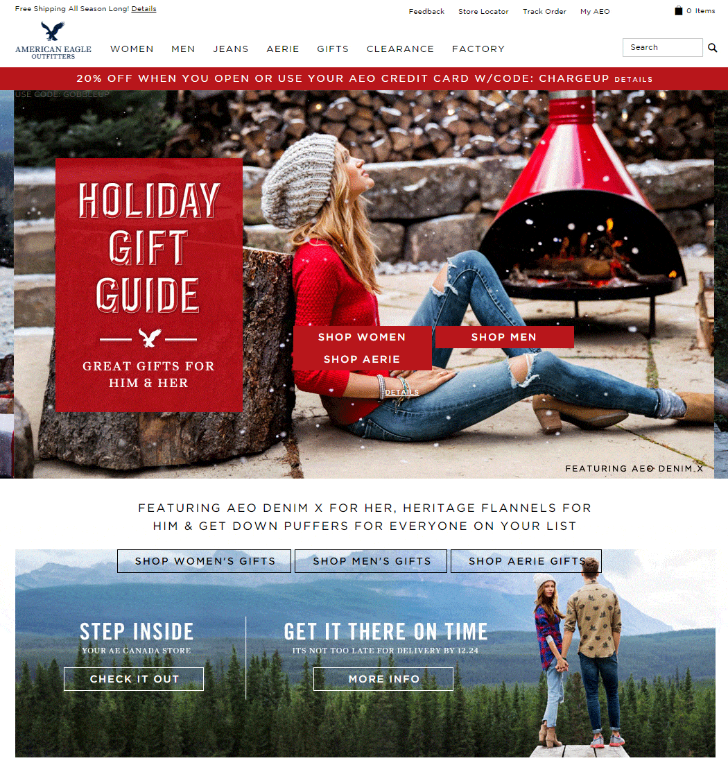
Checkout the American Eagle page below. While they use a bright red color for some of their CTA buttons, they curiously choose to put them on the red background of the model’s sweater. None of the CTA buttons on this page are any more distinct than many other page elements.
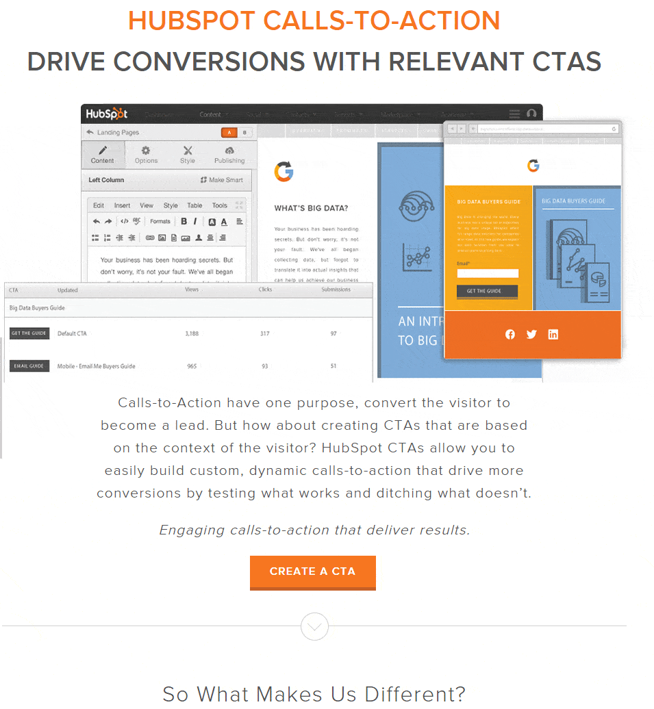
Hubspot shows how it’s done on a page about Calls-to-Action.
b) Use Benefit Driven Copy – Whether it’s on the CTA button, in close proximity, or both, if you want your customer to do something, like heed your call, it’s best to offer something in return.
Not only does Curves ask for too much information in the form we looked at above, they also don’t offer a benefit for giving the information. The very least they could do is change the button copy to “Get Answers Now! >”
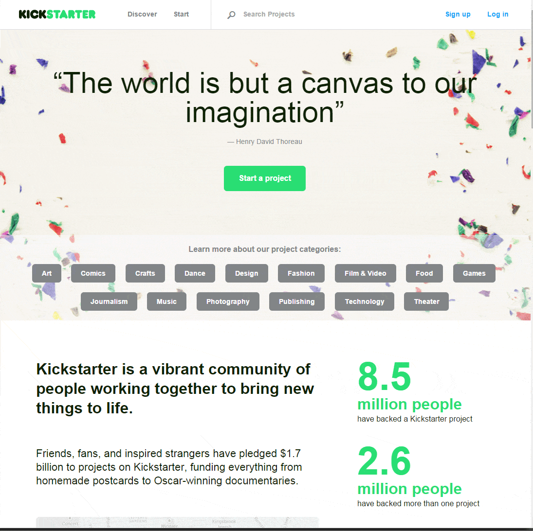
If you can’t outline a peachy benefit, tell them what will happen when they click the button, like Kickstarter does
c) Put Your CTA in the Right Place – Making your “ask” too soon or too late can be fatal for your conversions.
First, your CTA should be visible at some point above the fold. If customers don’t detect a CTA when they first land, you’ll lose those who are prepared to convert, but not ready to look around for how to do so.
But asking too soon, like the optimization subject of Invesp’s webinar on cognitive progression mentioned above, can be equally fruitless. The web designer placed the sign-up form for subscriptions above the subscription options and before the benefits. Again, conversion rates increased 90% after Invesp changed the CTA and its placement.
Remember, these are guidelines; mere starting points for you – and your customers – towards higher landing page conversion rates.