Editor note: All strategies outlined in this article should be deployed on your website using AB testing. By doing so, you will measure the effectiveness of these strategies and whether they work for your or not. We highly recommend using Invesp’s The Essentials of Multivariate & AB Testing guide.
Let’s start with the bonus!
I faced this situation many times: Our design team is busy working on a project for a client and we after creating the landing page, we discover we need a nicely designed call to action button to use in it. So we start searching for the perfect CTA to use.
If you have run into a similar situation, your search stops here. We have created over 200 different call to action buttons, in 10 different categories and using 7 different colors per category. The buttons are yours to use on any of your landing pages (buttons are available under the creative commons licensing – Attribution-NoDerivatives 4.0 International).
Download Your Free Copy of the 200+ CTA buttons
But we do recommend you read the guide below first to make sure the placement, the look and feel, and all other aspects are going to get you the conversions you are looking for.
17 elements of a highly converting call to action buttons
The following are guidelines you should follow when creating a CTA button for your landing pages and websites:
1. Measure the effectiveness of every call to action
Before you can judge the quality of a CTA, you must be able to measure its effectiveness. At a minimum, you should measure the click rate on the button (the percentage of visitors who click on a CTA placed on a web page).
CTA click rate = clicks on the CTA / total visitors to the page where the CTA is placed
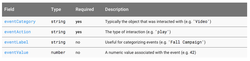
To measure the CTA click rate in Google analytics, you need to setup an event that is triggered when a visitor clicks on the button. Events are sent to Google analytics using the following code:
ga(‘send’, ‘event’, [eventCategory], [eventAction], [eventLabel], [eventValue], [fieldsObject]);
Google provides this table to explain the fields:
Let’s say that you created a CTA button which visitors will click to download an ebook. Here is how the call to Google analytics will look like:
onClick=”ga(‘send’, ‘event’, ‘download’, ‘ebook’, ‘the title of my ebook’);”
The button code will look something like this:
<a href=”mywebsite.com ” onClick=”ga(‘send’, ‘event’, ‘download’, ‘ebook’, ‘the title of my ebook’);”>Download the Ebook Now</a>
2. The foreign language test
If your page was written in a language that your visitor does not understand (old extinct language), can the visitor point out the call to action in less than 2 seconds?
Well-designed CTA buttons should be easily identifiable by any visitor, even one who does not understand the language of the page.
When you apply this test, you will have to design and place your buttons in a clear manner to every visitor. Here is the landing page from Kuwait Turk bank. This is one of the largest Turkish banks which we use for our European office:
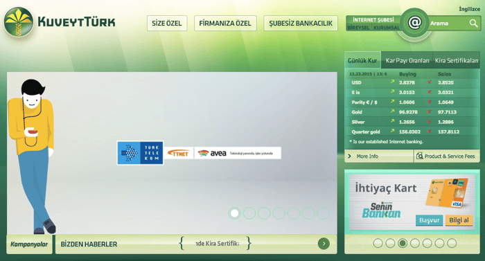
A good percentage of the visitors come to the website to use its online banking feature.
Can you tell where you should click to access online banking? I could not but I noticed that that website offers an English version, so I switched the language hoping to find where to click to find online banking:
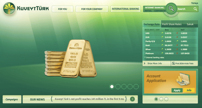
Can you tell where to click to access online banking?
It took Ayat and I a good 30 minutes of trial and error, until we finally gave up and had to call someone who is familiar with this page to point us in the right direction.
If you haven’t found it, it’s in the top right corner. Consumers or residential accounts click “Retail.”
3. Call to action button priority
Every page on your website should have one primary conversion goal.
This is the main action that you want visitors to take on that web page. The page might have secondary conversion goals but these secondary goals should have less weight and should be less emphasized compared to the primary conversion goal.
To determine your primary conversion goal on a page, ask yourself: what is the main action I want visitors to take on this page?
Take a look at the subscription page from livestream.com:
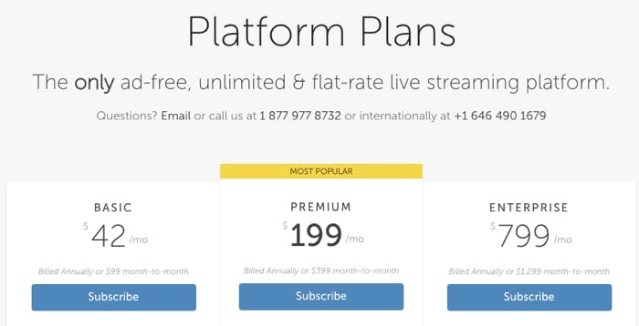
By just looking at the three CTAs on the page, can you tell what is the primary conversion goal for the page?
Which subscription option does Livestream want you to click on? The three CTAs use the same color, same box size, same placement and same copy.
Let’s take another example from salesforce main homepage:

Again, the page has three different call to action buttons on it. All buttons have the same weight, design and color. From a pure CRO perspective, Salesforce is not driving visitors to a particular conversion goal.
Let’s take a look at the home page of our friends at Hubspot:
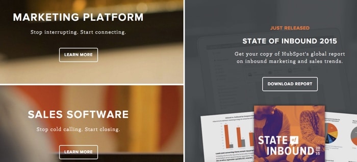
Hubspot has three different types of visitors who land on the home page with different goals.
Trying to satisfy the needs of these types of visitors can be challenging. The design team tried to solve this problem by dividing the top section of the homepage into three different areas using three different CTAs. The CTAs have (almost) similar weight and design.
Netline tried to solve the same problem (having different types of visitors come to its website with different goals) with this design:
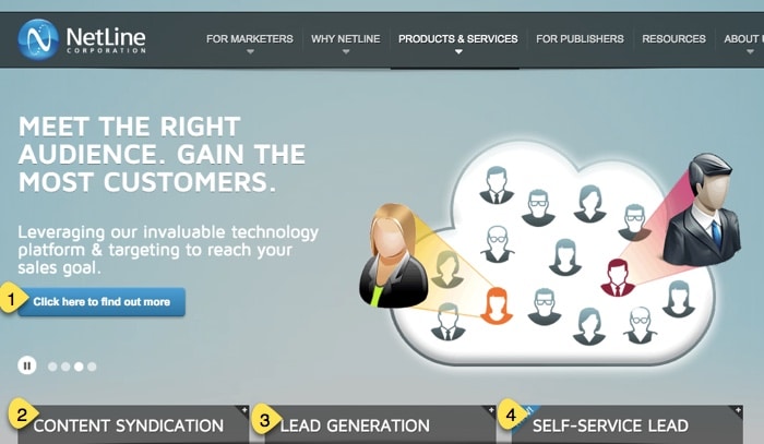
The primary conversion goal is button 1, which asks visitors to “Click here to find out more.” The text is on the button is not self explanatory and you need to read the headline above it to understand what information you will be presented with.
Buttons 2, 3, and 4 have the same weight and offer visitors different paths to follow to different sections of the website. Not an ideal solution but not so bad as well.
Let’s take a look at LiveStream homepage:

Here we see two call to action buttons. And while they are placed next to each other, the color of the “Get Started” CTA contrasts it better compared to the other CTA on the page (Talk to sales).
This is the homepage of wattpad:
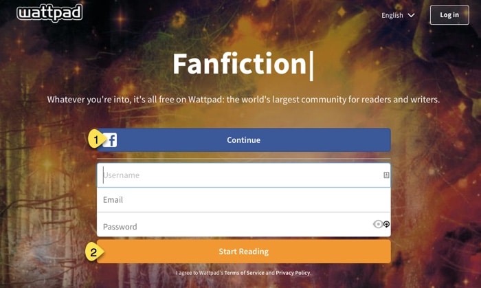
The homepage presents visitors with two options:
- Button 1: You can either use facebook to continue navigating through the website
- Button 2: Sign up for the service by filling your contact information.
While both buttons are large and clear, it is difficult to determine which option wattpad wants visitors to take.
In addition to that, wattpad relies on the user to figure out that he can choose any of the two options to start using the website.
This might sound silly to many who are working in online marketing, but to most online users the options are not that clear and should be explained.
This something we had to find out the hard way when we created MyInvesp. This was our original sign up page:
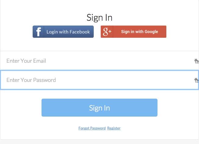
But most people were confused and thought they had to click on facebook and google+ and fill the form. Here is our new login page:
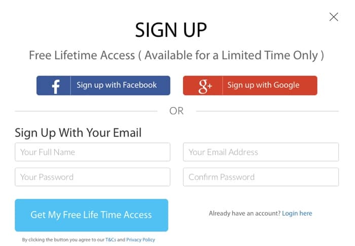
Can we improve this sign up page more?
Here is the homepage of Optinmonster:

The homepage has two conversion goals:
- You can either subscribe and get started with the service. This option is more emphasized with the green button (“Get OptinMonster Now”)
- You can watch the demo video (text link to watch the video)
The size, color and text of the green CTA makes it very clear that this is the action which optinmonster wants visitors to take.
4. Call to action button size
A good CTA must be visible on the page. Avoid small buttons that blend in with other elements. Reasonably larger size CTAs will out perform small size CTA buttons any time of day.
Here is the homepage of box:
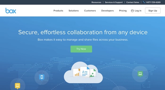
The CTA is placed on a line by itself, with a color that stands out. Could Box benefit from using a larger size button that stands out even more?
I actually had to go through almost 50 websites to find one that had a large CTA button. Our example comes from TaxJar:
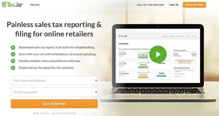
Notice how the homepage of TaxJar uses a large size CTA button with a color that stands out from the rest of the page.
5. Call to action button color
Contrast the color of the call to action button from the color of the background as well as other elements on the page.
If it blends in with other elements, then visitors might not notice it altogether which defeats the whole purpose of the CTA.
Here is the account creation form on Basecamp:
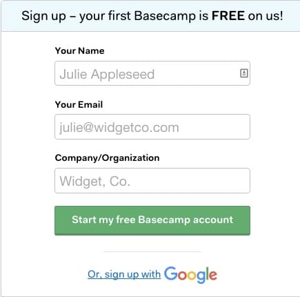
The button’s color stands out from the page. Also, while basecamp allows users to sign up for the service in two different ways (filling out the form or using Google to sign up), it is obvious which sign up option they prefer.
Compare that to the call to action button color from Netsuite:

Visitors could easily miss the button because of its small size and color which blends with the rest of the page.
6. Call to action button text
What text should use on the CTA button? What size and color should be the text?
Good text on a CTA should encourage visitors to act right away. The text on the CTA should ask visitors to take the action you want them to take in order for them to convert.
The text on ShipStation encourages visitors to start a free 30-day trial:
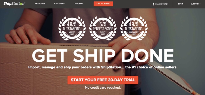
In addition, the home page reduces visitors’ FUDs (fear, uncertainty, doubt) in close proximity to the CTA by stating that they do not need to provide a credit card to get started.
I’m very surprised when I still see people using “submit” on their forms; which is just not a very nice action to ask of your visitors, and can have negative connotations.
7. Using Price Incentives with CTA
Incentives are design and copy elements which incentivize the visitor to act immediately. Incentives are excellent in reducing visitor FUDs (or friction).
Price based incentives utilize pricing to encourage the visitor to act right away. These incentives include:
- Discounted pricing
- Free trial offers
- Special bundling
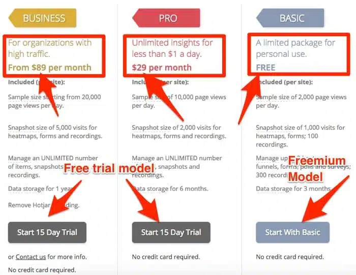
Most SAAS companies offer a free trial of their software. There are typically two different types of price incentives offered:
- Fermium model: offers a version of the software available for free. The user will have to pay for any additional features.
- Free trial: offer the full service for free for a limited time.
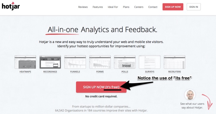
hotJar (one of our favorite tools) uses both the fermium model as well the free trial model. On their homepage, hotjar focuses on the free sign up:
On the pricing page, the site displays the different plans:
8. Use urgency incentives in your CTA
Urgency incentives rely on limiting the time of a specific offer to motivate the visitor to act right away. Urgency is very powerful in getting the visitor to act and should be used in several areas of your website design and copy.
You can use urgency with your CTAs by adding words such as “Now”, “Immediately”, or “limited time.”
When you limit the time of an offer, you are putting a limit on the freedom and personal choice of the visitor. Visitors react to that limitation by acting to remove the limitation thus converting.
9. Use scarcity incentives in your call to action
Scarcity incentives rely on limiting the quantity available of a product (or offer) to encourage visitors to act.
With scarcity, visitors are competing against each other to convert. The more conversions you get, the less products are available to other visitors which in turn drives more of them to convert.
Notice how Growth Marketing Conference tries to use this in their Facebook advertising:
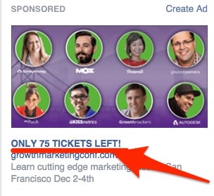
The only problem with this ad is that I have been seeing it for at least two weeks (if not more).
So, does that tell me that the conference is not able to sell 75 tickets in a week? It would have been a better policy to update the ad copy with lower numbers as more people register.
Urgency and scarcity are powerful conversion tools that rely on emotional factors to drive visitors to act. While most customer behavior research is focused on the rational or logical aspects of driving the consumer decision making process, emotional factors play an equally important role in the conversion process.
If you do not use urgency and scarcity to your CTA button text, then, at a minimum, you should use them in close proximity to the CTA to persuade visitors to act.
Jenny Hyde offers a marketing training course that uses incentives effectively on the registration page:
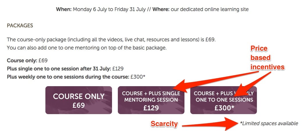
Incentives in practice
- Price based incentives: Order your copy to get a 10% discount
- Urgency based incentives: Order your copy in the next 2 hours to get a 10% discount
- Scarcity based incentives: Only 4 copies available
10. Use benefits or results to encourage action
Your website copy should focus on the benefits which visitors will get from doing business with you.
Highlighting the results which customers receive by using your product or service will increase your conversions. So, in addition to website copy, use the product benefits and results in the CTA text.
The homepage of Unbounce does it perfectly:
11. Call to action button design
A CTA button is a button!
I have to remind some readers of this because some of the CTA buttons I have seen look nothing like a button.
Some designers create nice banners and use them as CTAs. That might be fine in limited cases, but for most websites, a nicely designed CTA button is necessary to drive visitor action.
Here is the Organize for America homepage:
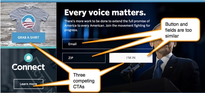
The page has three different calls to action that are competing for visitor attention. But the main conversion CTA (“I’m in”), uses a design that is very close to the design of the form fields.
Take a look at the Mozzila Firefox homepage:
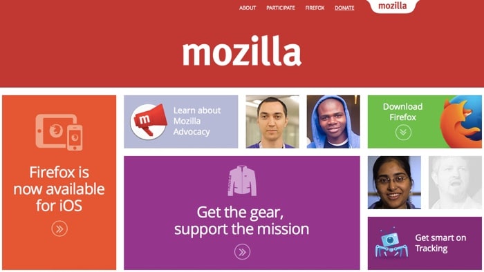
Notice how the download firefox button is not really a button anymore. It is more of a box. And it is difficult to notice the button with all the other elements on the page that could distract visitors’ attention.
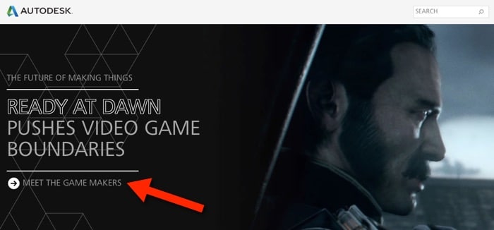
The homepage of Autodesk does not have a clear CTA and instead, it uses text link to drive visitor action:
Take a look at the homepage of Zoho:
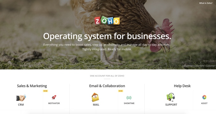
Where is the call to action button? Seems the designer forgot to place it anywhere above the fold!
12. Call to action button placement
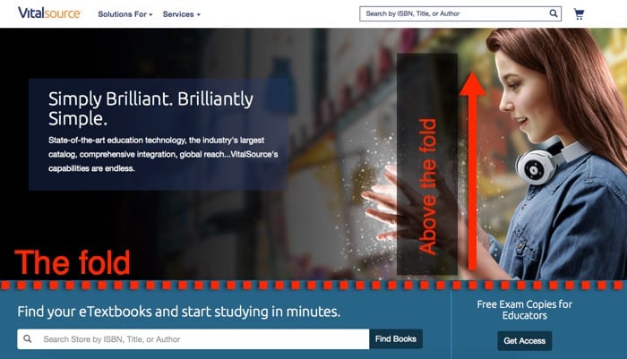
Place your CTA to stand out on the page. A good rule of thumb is to place the CTA above the fold.
The homepage of vital sources uses the prime real estate on the page for a large banner pushing the CTA below the fold:
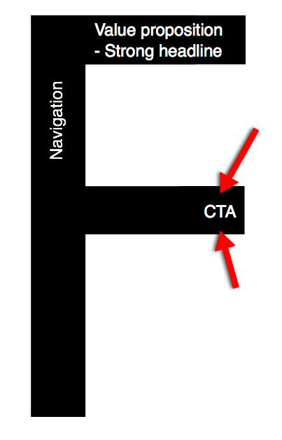
Make sure to consider the visitor eye path of the page. Studies tell us that visitors scan pages in a “Z pattern” and read the pages in an “F pattern.” Web usability expert, Jacob Nelson, states:
“Obviously, users’ scan patterns are not always comprised of exactly three parts. Sometimes users will read across a third part of the content, making the pattern look more like an E than an F. Other times they’ll only read across once, making the pattern look like an inverted L (with the crossbar at the top). Generally, however, reading patterns roughly resemble an F, though the distance between the top and lower bar varies.”
How does web reading and viewing patterns impact the placement of the CTA?
If you consider the F reading pattern, then we like to place the primary call to action button at the following location:
13. Use space effectively with your CTA
Adding space around your button will focus visitors’ attention on the CTA.
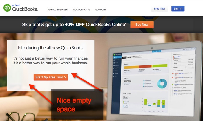
Make sure to have enough padding with your button. Quickbooks does an excellent job in leaving plenty of room around the CTA:
Stamps.com does a nice job as well in leaving ample space around the CTA on their homepage:
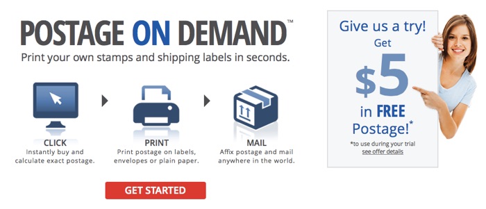
Can you suggest three things which stamps.com can do to enhance conversions?
14. Proper Assurances
After all these examples, it should be clear that there is nothing wrong with asking a visitor to take an action.
As matter of a fact, every page should have one primary conversion goal. As you ask your visitor to take the action, you must consider their mental and emotional state.
Are they ready to take the action you want them to take?
What FUDs (fears, uncertainties and doubts) would stop visitors from taking the action?
Before you can deal with FUDs related to a CTA, you should also consider the reward for taking the action. Let’s take couple of examples:
> Case 1: You are asking the visitor to provide his email address to download an e-book.
The reward: the visitor will download the ebook.
The FUDs: the visitor worries about getting spam from you.
> Case 2: You are asking the visitor to provide credit card information in order to place the order.
The reward: the visitor will receive the item after a certain period of time.
The FUDs: the visitor worries about credit card information stolen, item not meeting their satisfaction, or the item getting delayed in shipping.
As you consider both the reward and FUDs related to a CTA, you will be able to craft your copy and design to create an assurances center to the visitor. Assurance center emphasizes the reward of the action and minimizes the FUDs which visitors might have.
15. Remove distractions
There should be a measurable conversion goal for each page. Clicking on the CTA is our way to calculate the effectiveness of that page. Distractions are design and/or copy elements that distract visitors from clicking on your call to action button.
Visitors are constantly bombarded with advertising messages. We have no control over that.
The problem of distractions happens when a web page tries to do too much at the same time. So, instead of prioritizing how we want the visitor to view or read the page, we throw a large number of elements on the page and hope that the visitor will figure his way around them.
Distractions on page could happen for one of two reasons:
- Too many elements on the page competing for visitors’ attention
- Elements that take the visitor away from the page (promo codes are guilty here)
Notice the number of distractions Caesars casino has on its booking form:
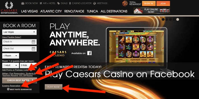
- Add Promo or Package Code
- Military, First Responders, Students & Teachers Receive 10% Off Rooms
- Existing reservations
- Play Caesars casino on Facebook
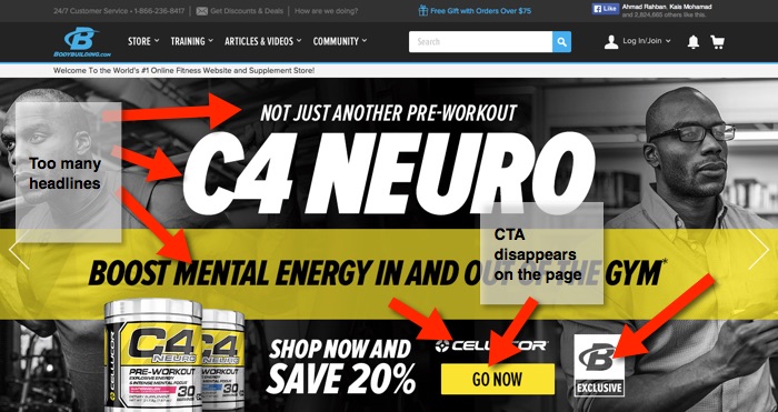
The homepage of bodybuilding.com has too many competing elements on it which can distract the visitor from the main call to action:
16. Understand the different types of calls to action and when to use them
This guide focused on CTA buttons. However, there is a different type of calls to action that you want to think about.
The example below displays text links (hyper links); which are different from the CTA buttons that grab visitors’ attention right away and direct them to take the action you want them to take. Text links are less pushy. Visitors understand them within the context they appear in. Let’s take an example from our Invesp homepage:
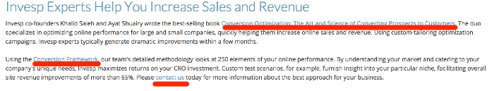
Notice how we used three different text links in the text:
- A link that takes visitors to the “Conversion optimization book” web page
- A link that takes visitors to the Conversion Framework web page
- A link that takes visitors to the contact us web page
So, when should you use a button vs. a text link?
- Buttons are excellent in driving a visitor to take an action. You should use buttons for the primary conversion goal of the page
- Text links should be used to provide visitors with information or to drive visitors to secondary conversion goals on a webpage
17. Test your call to action buttons
We all have seen examples where CTAs have significantly increased conversion rates.
Some case studies suggest that changing the CTA increased conversions by over 100%. Yes, limited cases like these exist but they are outliers especially if your existing CTA is well designed and placed.
If you follow the guidelines we provided in this guide, you can expect your conversion rate to increase anywhere from 5% to 15%.
Of course, you should always test any new call to action button design. Once you create a new design test it against the original CTA in order to measure its direct impact on conversions. As a matter of a fact, if you follow the principals outlined in this guide, you should be able to create close to 20 different tests on your CTA buttons.
Call to action case studies
Next, we will demonstrate the impact of CTAs on conversions using two different case studies.
Call to action case study 1: changing the location of the CTA
This was one of the first tests we implemented with one of our long time partner clients: A furniture retailer. Here is the design of the original product page:
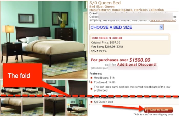
As you notice on the page, the CTA was placed below the fold.
This is design of the first challenger where we only moved the CTA above the fold and close proximity to where the product selection area is placed:
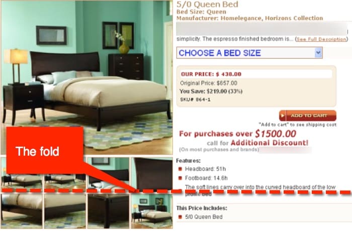
When we ran the test, the new placement generated a 54% uplift in conversions.
Call to Action case study 2: removing distractions and considering the visitor eye path
This test was conducted recently for a large clothing retailer.
The control
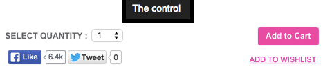
As you notice, the control had several problems in it:
- The social media icons in close proximity to the CTA were a distraction
- The quantity selection drop-down was placed on the opposite side of the CTA
To fix this problem, the team introduced this new design:
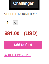
The challenger removed the social sharing icons away from the CTA. It also presented the information which the visitor needs to consider about in a vertical layout.
The challenger produced a 15% increase in conversions.
12 examples of glaring CTA mistakes
As we were putting together this guide, we visited some of the top websites in the world (in terms of website traffic).
We saw some websites with glaring mistakes. You can learn from these mistakes and make sure to avoid them on your website.
1. mysurvey
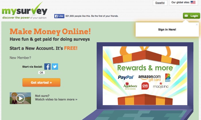
Can you see the number of competing CTAs on the homepage of mysurvey? The page has many competing elements that are thrown quickly on the page without any consideration for CTA balance or weight.
2. Weightwatchers.com
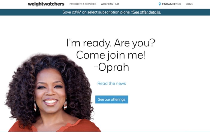
Weightwatchers.com uses white space effectively, however, the CTA used on the page is too small. The text on the CTA (“see our offerings”) is poor and does not connect with the visitor needs or benefits.
3. Alamo.com
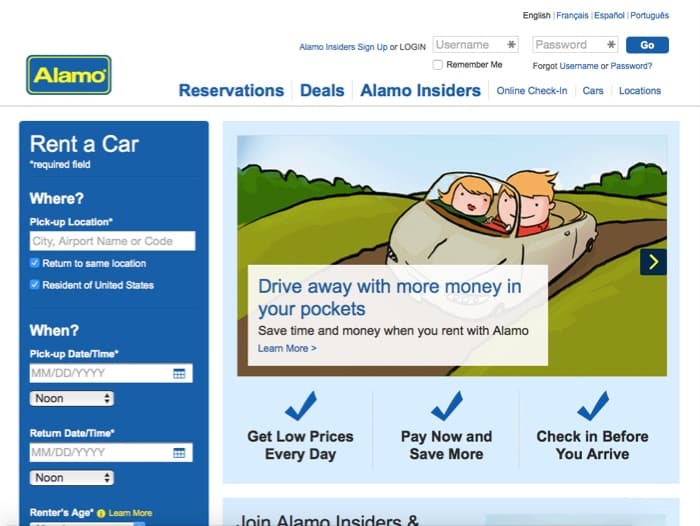
The booking form on Alamo has to be one of the worst we have seen in the auto rental industry. The CTA button is below the fold. The form has several elements that can distract the visitor away from completing the booking process.
4. Zipcar
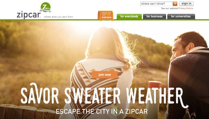
Zipcar is a great service for sharing car rides with others. The problem is that the top of the fold section has a small CTA (Join now) which blends with the colors of the page. In addition, the title on the page does not explain to the visitor what zipcar is.
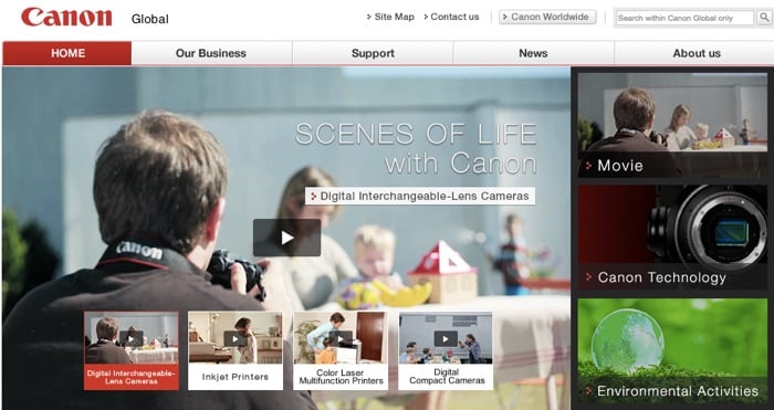
5. Cannon.com
The homepage of Cannon has what appears as two different CTAs that are poorly designed and poorly placed.
6. Cigna
Cigna is a provider of health insurance plans in the US. Notice how the top section has three different CTAs:
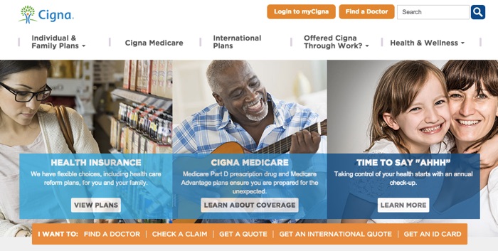
- CTA related to “Health insurance”
- CTA related to “CIGNA medicare”
- CTA related to “Time to say Ahhh”
That third CTA which occupies 1/3 of the top banner uses a headline that does not connect with what visitors are looking for.
More interesting is when you look at the visitor need identification right below these CTAs where the visitor identifies his need (find a doctor, check a claim, get a quote, etc). That section is the most important to visitors and addresses their needs yet the design gives it much less priority.
7. PlanetFitness
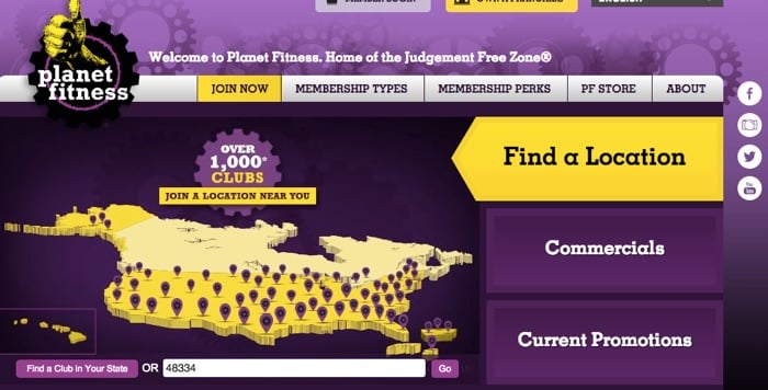
Plantfitness use of color is a complete fail (regardless to what colors the brand might require!). The homepage offers visitors three main sections with CTAs in each:
- Find a location
- Commercials
- Current Promotions
When was the last time you visited a website to watch its commercials? Items 1 and 3 (Find a location and Current Promotions) are most relevant to most visitors. Notice however the Find a location form:
- You can find a club in your state: Not sure when people will ever look for a club in their state as opposed to a club next to their house.
- The CTA on the address form is too small and does not use persuasive text (“Go”)
8. GNC.com
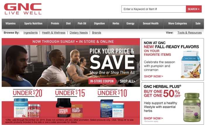
GNC’s homepage is a typical page of large corporate website with too many competing offers, leaving the visitor confused of where to go. The main CTA on the page is too small and difficult to notice.
9. mega.nz
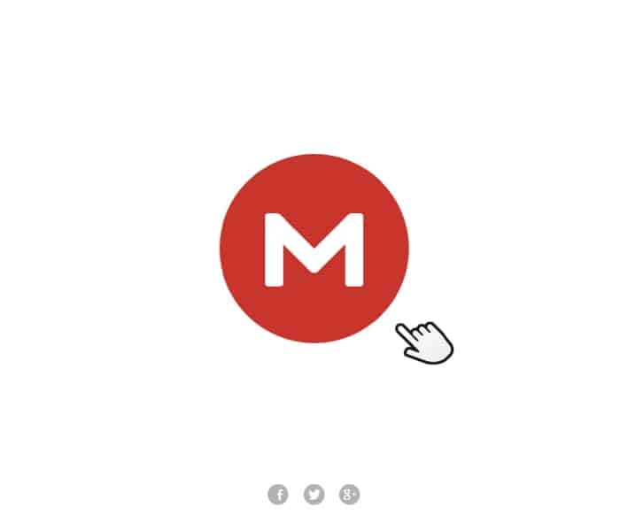
mega.nz is a large player in the file sharing space. The problem is that design of the home page was too clever relying to visitors to move the cursor across the page to learn what the site has to offer. The design NO headline and NO clear CTA.
10, ADP.com

ADP provides payroll and tax services. The designer decided to highlight the headline with different colors (looks a bit strange), the headline itself could be improved and finally there is no clear CTA on the page.
11. Accenture

For one of the largest consulting firms, Accenture homepage is one of the most self centric pages we have seen. The page uses a slider with 5 slides. Three of them are focused on Accenture and what the company does as opposed to what visitors are looking for.
12. Payoneer
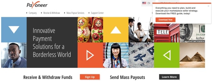
Our last example comes from Payoneer. The page has three CTAs and the text on each of them is too weak. In addition, the location of the two main CTAs (Sign up and learn more) could easily be changed to focus on visitor benefits.
Don’t forget to download Your Free Copy of the 200+ CTA buttons
Please let me know what you think: we are working on several well researched guides such as this one and would love to hear your feedback and comments!