Critical reviews of at least some of the promotional messages in your email inbox is like doing your conversion optimization homework. It exercises the lessons you learn from testing and experience. Someone could talk to you all day long about the benefits of matching subject lines to headlines, but until you experience a spectacular failure, or feel a bond to a well-matched message, you really don’t make an emotional connection with the lesson – and you don’t learn it as well.
Landing Pages & Email Messages: They are two separate channels with significant differences, from purpose to personalization. But what seems to be missing from the thinking of many email designers is that there are significant similarities too. In many cases, the only difference between the two is that emails are pushed and landing pages pull.
Even on a completely personalized cart abandonment re-targeting email, many of the best practices of conversion optimization for landing pages apply. From the aforementioned subject line/email headline match (ad copy headline/page headline match in landing pages), to having clear calls-to-action, a lot of what you know about landing page optimization doesn’t need to be reinvented for email optimization.
But you wouldn’t know it by looking in your Inbox. Here we go:
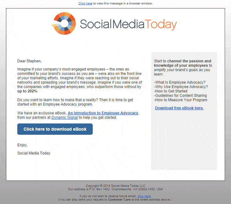
Social Media Today
I feel so bad. I really like SMT; I read lots of their content and have attended more than a few of their webinars andall have been good. That’s why the email message below is so surprising. It would be difficult to design and write a less inspiring email.
- No Headline – OK, considering this email is written as a message more than in a landing page style, the fact that the first sentence reinforces the headline is good enough.
- No Image – If the email asks the reader to ‘imagine…’; then imagine what an image would do for the look, feel and delivery of the message – and the email’s conversion rate.
- No Link on the Logo – At first I thought it was me. Maybe the universally accepted best practice of making your logo clickable doesn’t translate to emails. Wrong. A flight through at least 10 other emails found that all have links on the logo. The best of them have links to a landing page that matches the email message.
- Copy – Benefit-driven copy may not be ideal in every situation. But toss the customer a tidbit at least. Except for the word ‘free’ in the headline, the first sign of a benefit is in the last line of the first paragraph. Maybe. Other than that it’s all “Imagine…’ this and ‘Do you want to learn…” …. zzzzzz.
The Drake Hotel – Toronto
Spoiler Alert: If you don’t want to see where this critique is headed before we get there, don’t read the following statistic, as reported by marketingland.com:
- Percent of emails opened on mobile devices: 66
Background: Unlike it’s larger, more famous namesake in Chicago, Toronto’s Drake is a small, trendy boutique hotel located in the ‘coolest’ English-speaking neighborhood in the world, (according to Vogue anyway). Nuit Blanche is trendy, night-time arts festival held annually in a number of cities around the world, including Dallas, Minneapolis and San Antonio in the U.S..
With that prelude, you could imagine how it tickled my suburban heart to get an email from The Drake inviting me to their Nuit Blanche BBQ. Visions of chatting wittily about the latest Michael Gondry video, while sporting my pastel-colored jeans, danced in my head.
And you could imagine the equal and opposite confused disappointment when met with the following after opening the message on my phone.
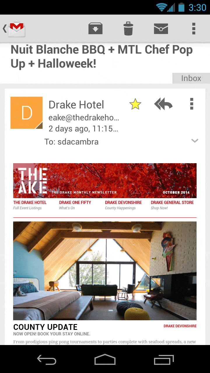
- Headline Mismatch – The email subject line gives The Drake three chances to confirm at least one of its promises in the email headline. They miss them all. Indeed, the email’s headline ‘County Update’ is not only miles away from anything in the subject line, but also from anything I associate with the hyper-urban Drake. (It refers to the recent opening of their country counterpart).
- Image Mismatch – Like the headline, that’s not The Drake I know.
Not only does The Drake completely miss the opportunity to confirm that I’m in the right place by reinforcing the subject line in the headline, but it’s like they go out of their way to make me wonder if I’m even in the right email. An email that promises to be about three urban events should not kick-off with a promotion for a new country inn.
Mirvish Productions
First, you’re not having calendar confusion. ‘Thanksgiving’ in the email below refers to the Canadian version, which is on October 13th this year.
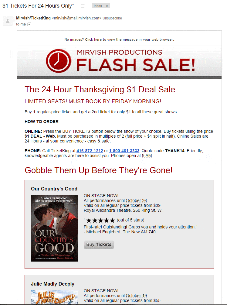
Is this a near-perfect email message? It’s not the prettiest, but here’s evidence to support a ‘yes’ vote:
- Headline – While the headline, ‘Flash Sale!’, does not match the subject line, ‘$1 Tickets for 24 Hours Only’, the sub-headline does and, considering the headline is displayed in a masthead format, it adds prominence to the sub-head.
- Urgency – Being a holiday-based promotion, clearly you better order sooner than later.
- User Experience – It is here that this email becomes exceptional. Having established that urgency is in order, the email gives you exactly what you want, “How to Order”. The perfection of the tactic lies in the fact that the sender wants precisely the same thing. And then the copy eliminates any uncertainty or concern with clear instructions for both online and offline ordering. Brilliant.
- CTA Buttons – So how is it that an email that does so much so well has “Buy Tickets’ CTA buttons that are grey on grey? Hopefully the answer is that the designers tested and found this to be the best color combination. But, judging from the vast majority of test results on button color, that’s unlikely.
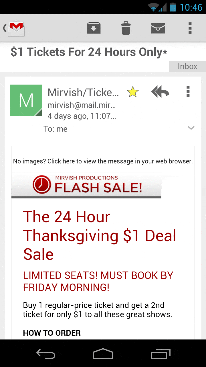
Bonus Points – The mobile version of the message manages to accomplish all the good stuff too. Yes, the ‘How to Order’ info isn’t visible, but the heading just above the fold tells the reader that it’s there.
Want to learn more about how to get higher conversions from your email messages and/or landing pages? Ambush your inbox. It’s like homework, but a lot more fun.