
Striving for balance between a clean innovative design and detailed useful data on products and services is a hard task, especially when you want to have a high-converting home page as a result.
As 86% of visitors want to see information about your company’s products and services, once they land on your homepage you should add as much operative information visitors need, but you should as well ease their way into getting acquainted with all the value your company can provide to them.
From your visitors’ perspective, four pressing doubts arise while landing on your homepage. Dive in to find out how to address these doubts, connect visitors’ needs to your page’s purposes, convert more and create a welcoming experience your audience will cherish.
The challenge of multipurpose homepages
As the entryway to your business, the homepage on your website assumes multiple purposes.
From welcoming visitors to conveying a captivating brand, homepages are busy multi-taskers absorbed in leading visitors to desired internal pages, showcasing products and services, and unveiling authority and commitment of professionals.
To add to the multitasking challenge, visitors’ attention span lasts around 10 seconds, concentrating 84% more on the area above the fold. Besides tending to visitors’ impatience, homepages also need to cater to different phases of the customer journey for each visitor. Then the design comes in and spices up the challenge, as the page should strive for a familiar yet innovative design, to comfort visitors but also stand out from the crowd.
In a nutshell, to become a conversion machine, your homepage should:
- Present your company, but focus on visitors
- Focus on visitors’ needs but address a wide variety of interests at different moments of the customer journey
- Address a variety of customers’ interests but especially do so in a ten-second time-span and above the fold
- Communicate core data on your services above the fold but recognize that size and format of the above-the-fold area vary among mobile and desktop screens
- Have a familiar design and feel but strive for distinction.
Sounds far from being easy, right?
We know, that you enjoy challenges. Let’s face this one together. We will come up with a revamped optimized homepage for your website.
Let’s start
As a starting point, leave all considerations about your company aside and focus on your visitors. The target is to attend your ideal customers’ needs, not to ramble about yourself.
Get your customer personas together over a cup of coffee, and analyze their needs, desires, and buying actions. Map your customer journey with the conversion funnel’s phases of awareness, interest, desire, and action.
Customers’ experiences and expectations should base any decisions on your site’s performance. Look at your homepage from the perspective of first-time visitors and returning prospects and recurring clients.
Once you have accounted for your visitors’ needs, reinforce, or redefine,the purpose of your homepage. List the objectives the page must achieve. Would you like your visitors to search your catalog? Find out about the unique services you offer? Sign up for a free trial? Set specific, attainable goals.
With the persona’s needs and homepage purposes on hand, let’s see four questions in visitors’ minds when they arrive at your site with examples of how three e-commerce and three services pages address these doubts.
Four questions to answer on your homepage from your visitors’ point of view
As brick-and-mortar storefronts attract passersby in busy streets, your homepage should do the same.
But you are online. You cannot set a neon sign over a window-display, offer dog treat freebies at the door, or send roasted coffee scents down the block. How can you get visitors interested in your store?
Remember, we are following your costumer’s journey. What would they think as soon as they landed on your homepage? What concerns would they have?
Here are four questions that populate visitors’ minds once they find your website:
1.“Am I in the right place?”
2.“Do you have the specific product I am looking for?” or “How can you help me?”
3.“I have a question. Can I ask you?”
4.“Can I trust you?”
Let’s see how six websites chose to answer these questions in their homepages. We will take a look at three e-commerce sites specialized in backpacks, Tortuga, Osprey, and JanSport, and three services pages, Kathy Caprino, for coaching services, Neo Law Group, for legal counseling for nonprofits, and DeskBeers, for drink delivery.
Now, on to your visitors’ questions.
1. “Am I in the right place?”“Yes, sure, [insert value proposition]”
For first-time visitors at the awareness stage of the conversion funnel, you should clearly state your offer, pointing out the unparalleled help your products and services provide.
Visitors will only stay a little longer in your shop if you confirm they are in the right place to solve their needs. A strong value proposition helps you in convincing visitors to stay longer than 10 seconds in your site by connecting to them through an appealing offer that makes you stand out from competitors.
Composed by a headline, a subheadline, a visual element, and optional three-points bulletin, a value proposition is your superpower to answer fast and accurately this visitors’ doubt:
- “Am I in the right place?”“Sure, only here you can find this special paper for your wedding invitation, in the color you need, delivered by the time you need.”
- “Am I in the right place?”“Sure, only here you can find the right outdoor apparel for your next adventure, affordable, in many sizes, in matching colors.”
From our examples, “Live on your terms” is Tortuga’s value proposition.
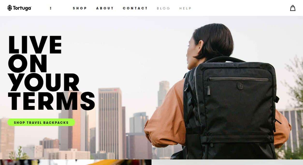
- While “Live on your terms” sounds a bit general at first glance, it is accompanied by “Shop travel backpacks” and a hero image of a person using their pack in an urban landscape.
- The pack stands out in the picture, and matches the color of the words in the value proposition. As the design of the backpack is part of the value proposition, the image plays a crucial role in the association with the sentence.
- From this first encounter with the brand, visitors recognize Tortuga sells big backpacks, for urban travelers.
- The proposition, though general, connects to customers’ desired lifestyle of exploring cities worldwide. The next two pictures and subtitles do not appear above the fold but reinforce the proposition: “Outbreaker Bring everything you need without checking a bag;” and “About Tortuga. Why living on your terms matter.”
Osprey’s value proposition and imagery above the fold portray they sell packs for nature explorers.
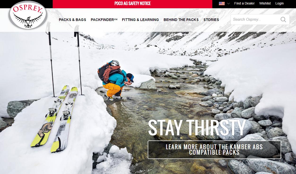
- The picture holds a lot of information, but it is still possible to check the backpack being used by the person in the scene.
- “Stay thirsty” is a general proposition, but it still connects to ideal customers’ lifestyle.
- The proposition is developed further, down the homepage, with the explanation that “Osprey is a passionate tribe of wanderlust afflicted adventurers building the best packs in the world for your greatest trips.”
- Their value proposition booster, an “almighty guarantee, any reason, product, era,” is only displayed at the bottom, at the end of the homepage.
JanSport holds a larger catalog of bags, so they chose to display a carousel above the fold on their homepage.
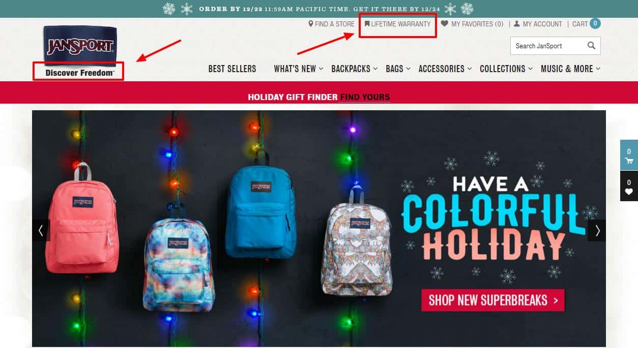
- Carousels make it harder for visitors to identify the value proposition, as multiple propositions and central images show up,without prioritizing information.
- Visitors can identify JanSport sells backpacks, but might get overwhelmed by too much information.
- Their tagline remains static, under the logo, on the left, “Discover freedom.” Besides being generic, the tagline does not work as a value proposition.
- Their proposition booster, “Lifetime warranty,” is displayed above the fold.
- Down the page, their explanation of “We’re about the journey, the discovery of fun, freedom, and adventure,” could be the value proposition, but it remains too general to convey the uniqueness of their offer.
About her coaching services, Kathy Caprino announces visitors, “It’s YOUR time to build a successful career you love.”

- With a clear value proposition, Caprino focuses on visitors’ needs, by assuring them they are at the right place to switch to more fulfilling careers.
- Visitors can readily understand the benefit of the service she provides.
- As she is offering a service, not a product, her picture looking directly to the visitor is a powerful validation of trust.
- The tagline “Your path to career bliss” reinforces the value proposition.
Neo Law Group chose a descriptive proposition.
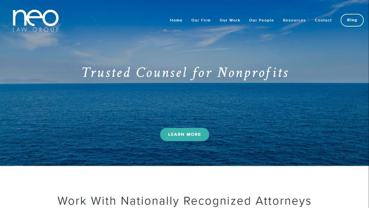
- “Trusted Counsel for Nonprofits” explains the work they provide, but falls short in demonstrating the value of their services to the visitors.
- While visitors may understand and recognize the type of service being offered, they might not acknowledge the unique aid these lawyers are capable of providing.
- The image of water is too generic to convey the particular value of their services.
The drink delivery service of DeskBeers is well explained for visitors upfront.
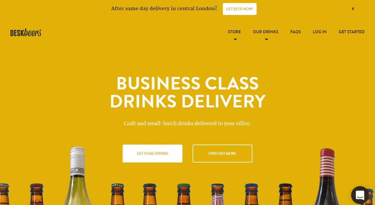
- Visitors can quickly identify that DeskBeers deliver drinks to offices. The name of the company helps in clarifying the service provided.
- The value proposition emphasizes their focus on providing high-quality service to companies.
- As they offer a unique service, the simple explanation of “Craft and small-batch drinks delivered to your office” already makes the company stand out.
- The picture of a line of bottles explicitly sets the central object of their offer.
How can you improve the value proposition on your homepage?
Coming up with a value proposition demands effort, but it is avital part of establishing your brand, intrinsic to other aspects of your shop, as product pages, design, customer service, “work with me” pages.
- Find out about the various types of value proposition.
- Check our webinar to learn trade secrets to creating a unique value proposition that draws more customers in.
- Here are some additional guidelines on generating both a regular value proposition and a proposition for selling products and services that are not unique.
- For consulting services, you can find guidance in these ten commandments for building a value proposition that sells.
- Here is a value proposition canvas to help you.
2. “Do you have the specific product I am looking for?” “Sure, here it is!” Or “How can you help me?” “Oh, so many ways!”
After recognizing your offer, first-time and returning visitors, at both awareness and interest stages, want to validate that their needs can be fulfilled by your products and services.
At this point, customers wonder, “ok, this shop sells backpacks. I need one of those. But I need a specific one to carry my laptop to school. In green. With white polka dots. Do they have one in stock?” Be ready to answer “sure, look, here it is,” or “sure, it is in that section over there,” or “sure, just type it here, and it will magically appear.”
To address visitor’s concerns at this moment, you can either opt to display a considerable range of products on your homepage, tricky option for large catalogs, you can create a well-designed intuitive navigation, always a respectable asset to a website, or you can position a visible easy-to-use search box, a fundamental addition to an e-commerce.
Visitors at services pages, at this point, are wondering “How can you help me?” Make sure you promptly respond,“Oh, so many ways!” These visitors already understand your services help them in achieving specific goals, your next step is to underline how your support takes form.
Tortuga offers a single model of their product, so it makes sense for them to display it on the homepage.
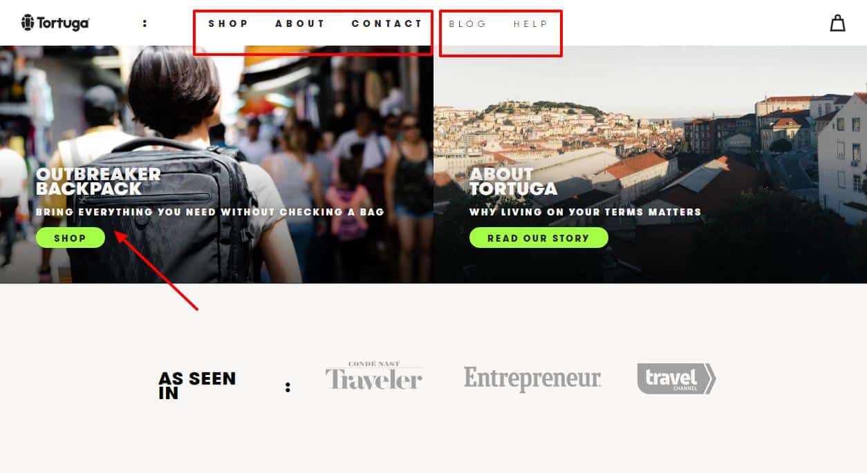
- The Outbreaker Backpack appears right after the hero image, on the left, with an additional subtitle.
- Alternatively, if visitors click on “shop,” the first option of the menu on top, they are also redirected to the product page of the backpack.
- Highly clear, intuitive navigation, with the most relevant sections emphasized in bold, in contrast to the options “blog” and “help.”
- The lack of a search box in Tortuga’s homepage is completely justifiable, as they do not cater an extensive
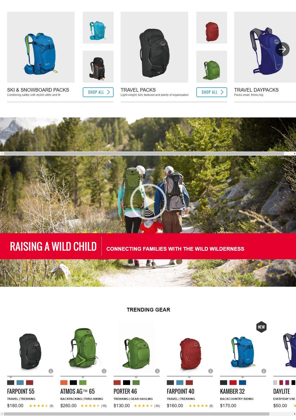
Osprey chose a drop-down menu, above the fold, and the display of two rows of products, below the fold, separated by the image of a resource video.
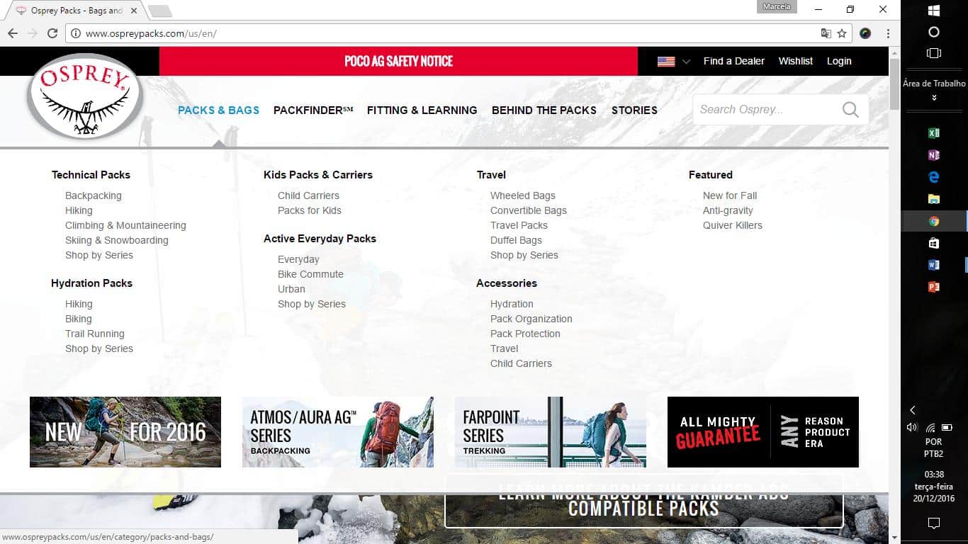
- The drop-down menu is easy to find, with “packs and bags” as a first option, and the appearance of the value proposition booster, an “almighty guarantee, any reason, product, era,” at the bottom of the menu.
- Although lacking auto-fill and auto-correct suggestions, the search box is easy to find, at the top on the right side.
- The first display row shows categories, while the second presents products. Neither one overwhelms visitors and both are made with clear photos and short descriptions.
- Visitors can easily search the catalog offered by Osprey, by using the menu, the search box or scrolling down.
JanSport also opted for a menu on top, above the fold, and a display of categories and products in two rows, below the fold.
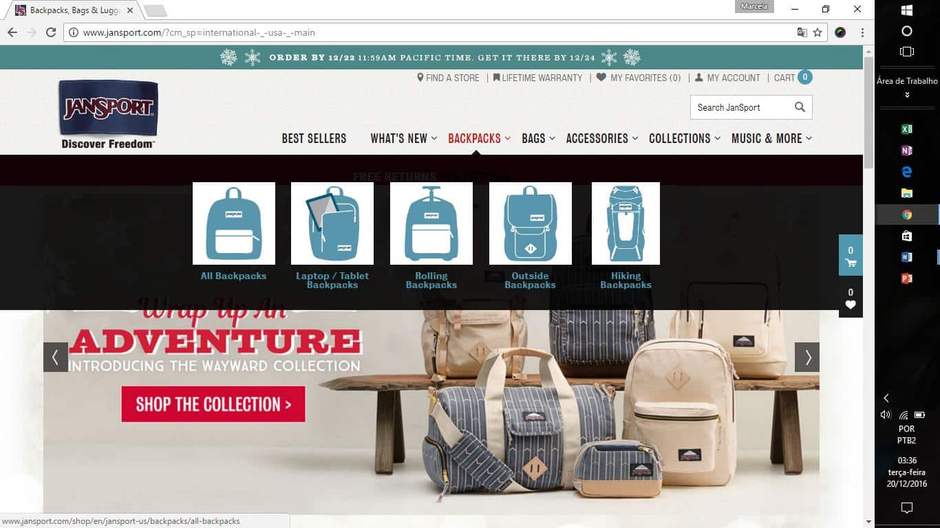
- The menu shows options of categories in detailed icons of the backpacks and bags. The icons are helpful in allowing visitors to identify faster the models they are looking for.
- A robust search engine with auto-fill and auto-correct suggestions is accessible in the search box at the top right. The box is easy to identify, separated from the menu list, placed as a single item.
- Category and products display rows, however, lack clear indication and minimum descriptions.
Kathy Caprino explains three ways she can help visitors, right below the fold.
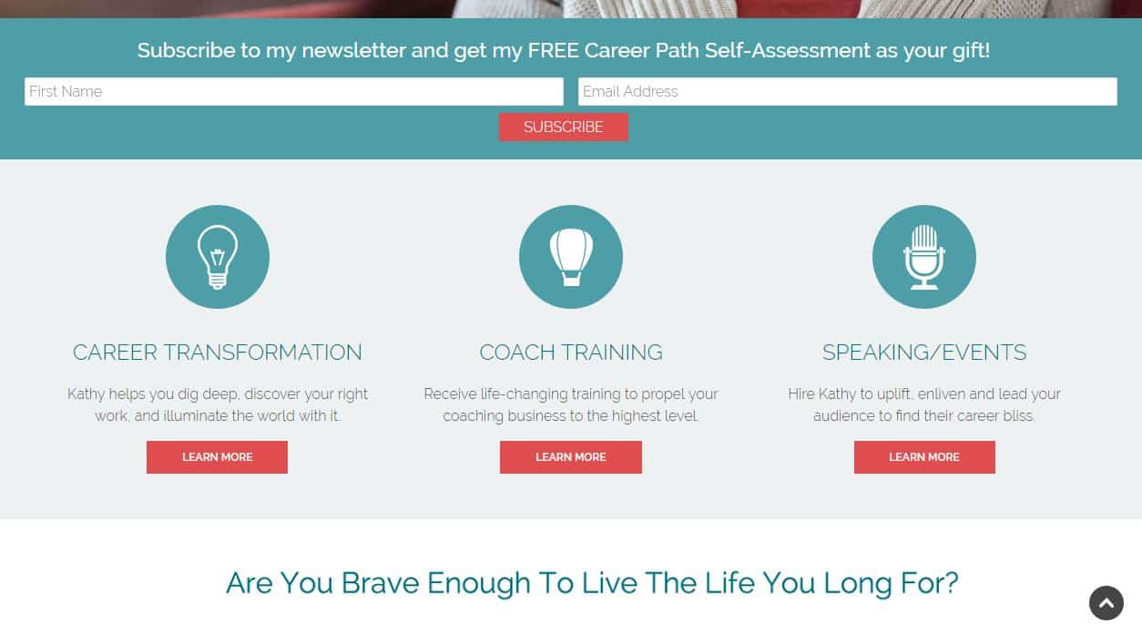
- Below the fold, visitors discover Kathy may assist them with career transformation, coach training, and speaking at events. Each format has a visitor-centered description, highlighting benefits of the services. All three options have links to pages further explaining each one.
- The icons are a bit vague to represent the services. The lightbulb is too common, as the balloon is too recurrent. Neither one specifies the services she The microphone at the end is the most accurate one, but also too general.
- Besides these three short descriptions, the menu, above the fold, holds a third option of “How I help.” Visitors might find this answer right away, above the fold, or by scrolling down just a bit.
Neo Law Group uses a short video to mention the services they provide.
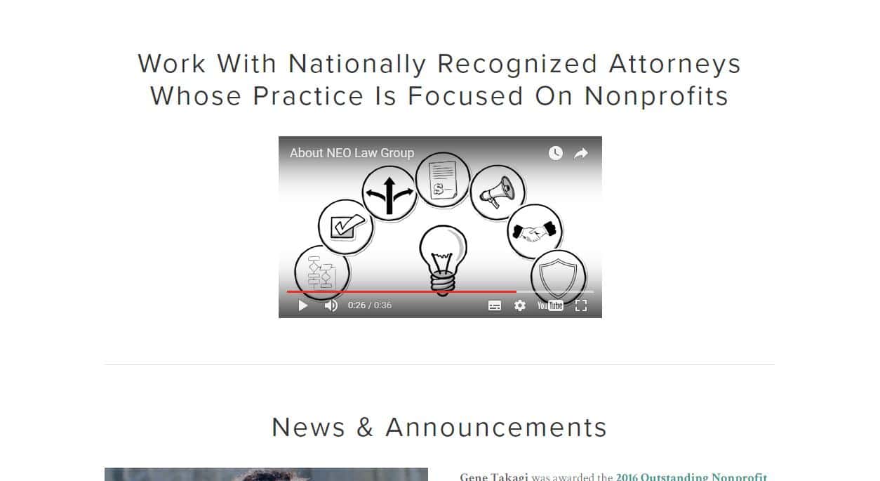
- A title describes they are “nationally recognized attorneys focused on nonprofits.”
- A short video describes what they do.
- Neither the text or the video address the formats of their services, the “how.”
- The icons used in the video are slightly specific, but the omnipresent general lightbulb remains a central feature.
Deskbeers shows a detail explanation of how their services help their customers.
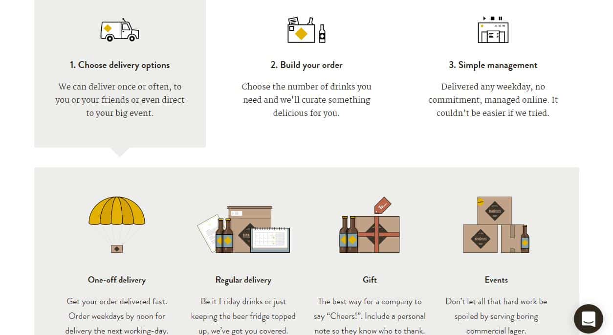
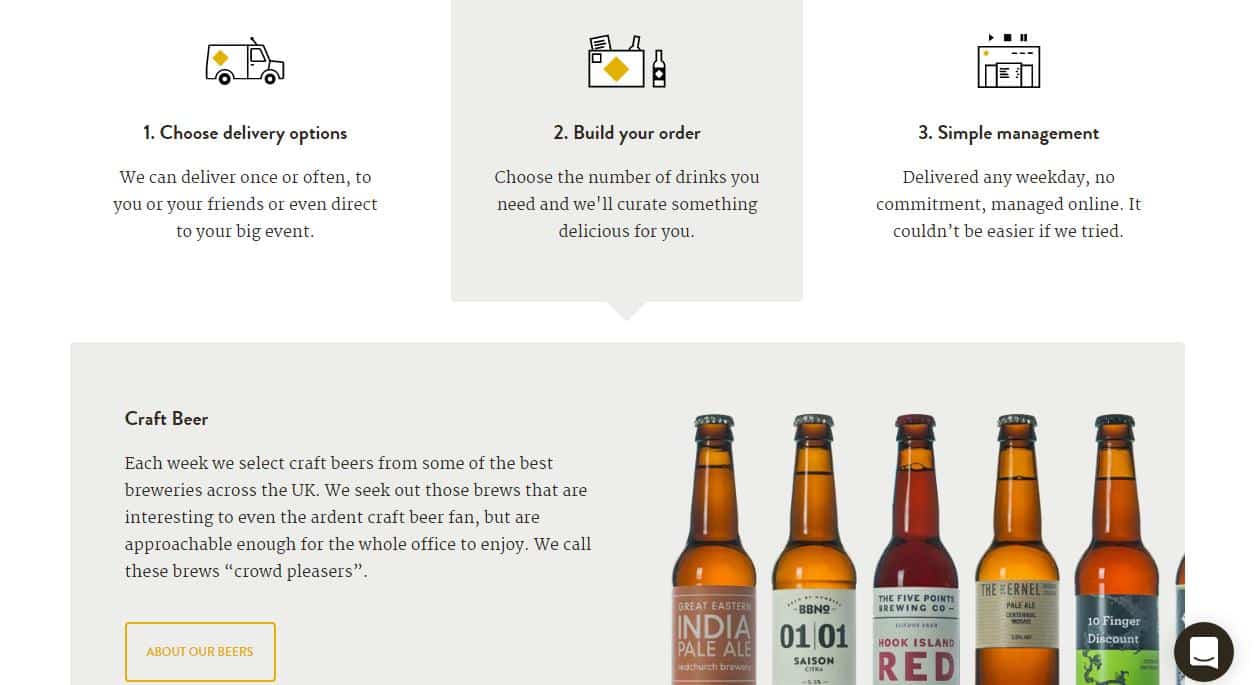
- The service is explained in three steps, easily identifiable, below the fold.
- Each stepshows customer-centered explanations. Visitors may click on to discover more, but primary information is readily providedon the homepage.
- The icons were designedspecifically for their services and illustrate with precision the explanations of each step.
How can you improve products and services display on your homepage?
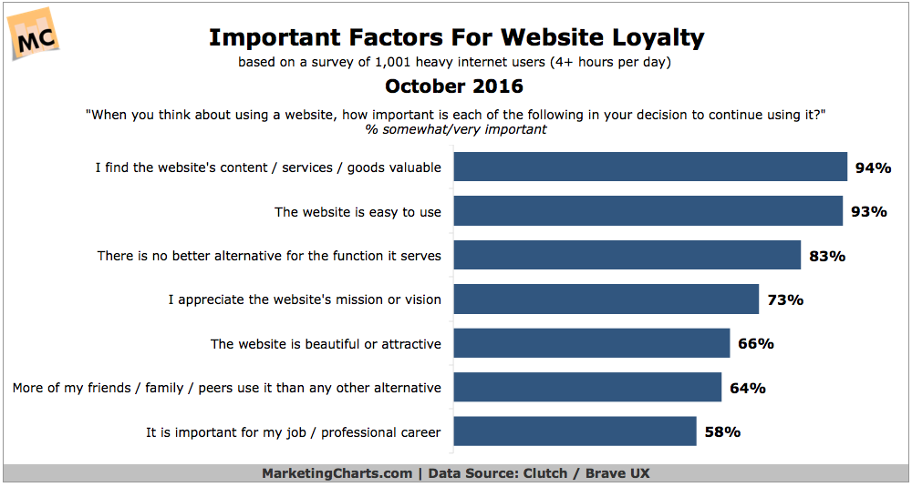
Your homepage should both inform visitors of product and services and lead them to find more information on the site. As 93% of internet heavy users become loyal to websites that are easy to use, strive for clarity.
- Design and organize content focused on human behavior, here are 113 guidelines to help you.
- Pay attention to usability details, as the hamburger menu.
- Consider the differences in usability for desktop and mobile experiences, as 70% of users on mobile devices scroll down the homepage when first landing site, against 25% of users who exhibit the same behavior on desktop.
- Check these tips from specialists on e-commerce homepage best practices.
- Find suggestions and insights for e-commerce search in these articles.
- Create an easy to find search box.
- Follow tips on enhancing navigation on professional services websites.
- Choose images and icons with care.
3. “I have a question. Can I ask you?” “Sure, what would you like to know?”
Visitors at interest and desire phases are researching to find the perfect affordable match for their needs. So, they might come back to your site to ask a few questions before buying.
Returning inquisitive visitors are great news. They are interested enough to look for answers for their specific concerns, as “do you ship this product to my country?” or “how long will it take to ship?”.
Detailed doubts arise when visitors are interested in closing the deal. It is your turn to say “We’re here for you. Just shoot your questions, we’ll answer them all.”This is the moment to establish contact, offering as many possible ways to visitors find and reach you. Remember,64% of visitors want to see the company’s contact information on a homepage.
You might offer a phone number, an email address, a contact form, a social media link, or live chat. FAQs section work as well, but they allow a less personal experience to customers.
Tortuga offers two options at the top menu, “contact” and “help.” These options link to a FAQs and form page, where they indicate names and pictures of their customer support representatives, as well as how long it will take them to reply. When scrolling down to the bottom of the page, visitors also find contact and help information.
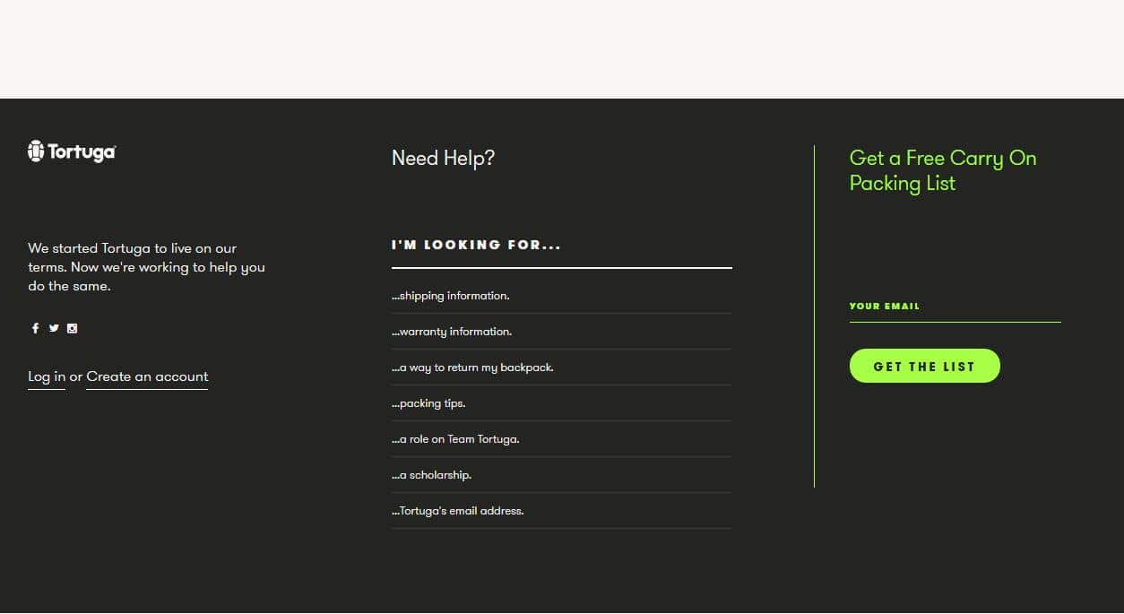
- Easy to find contact and help options, at the top menu.
- Easy to find contact and help options, at the footer.
- FAQs sections are linked directly, so visitors do not need to go to another page and then look for, for instance, the section on shipping information. The sections are already laid out on the homepage.
- Social media links are placed on the left, at the end of the page, so visitors can establish contact, but do not get too distracted from Tortuga’s offers displayed above.
Osprey provides a “find a dealer” option at the right top. The “fitting and learning” option at the menu shows a link to the FAQs page. All other contact information is available in the footer.
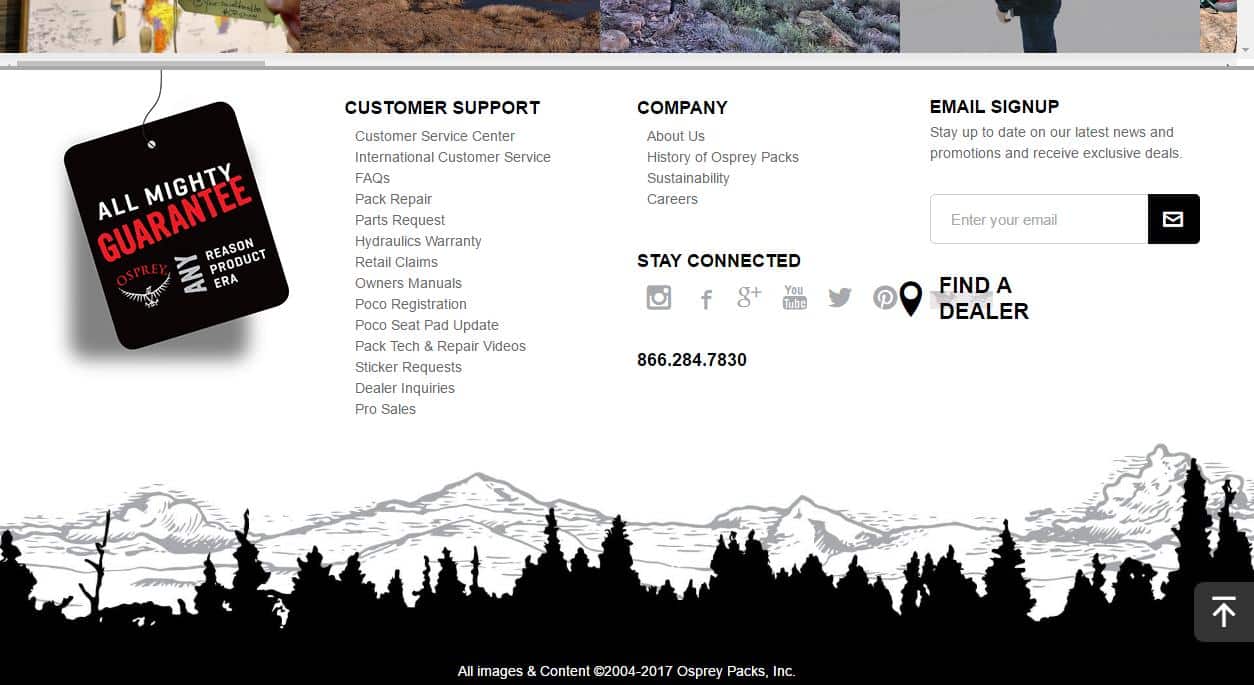
- Customer support links are specified, guiding visitors to areas of interest and inquiries.
- Customer support is the first column of links at the footer.
- Support phone number available.
- Social media icons and links placed only at the bottom of the page.
JanSport offers a “find a dealer” option on the top menu. The website footer indicates customer service links with “contact us” and “FAQ” links, as well as a support phone number.
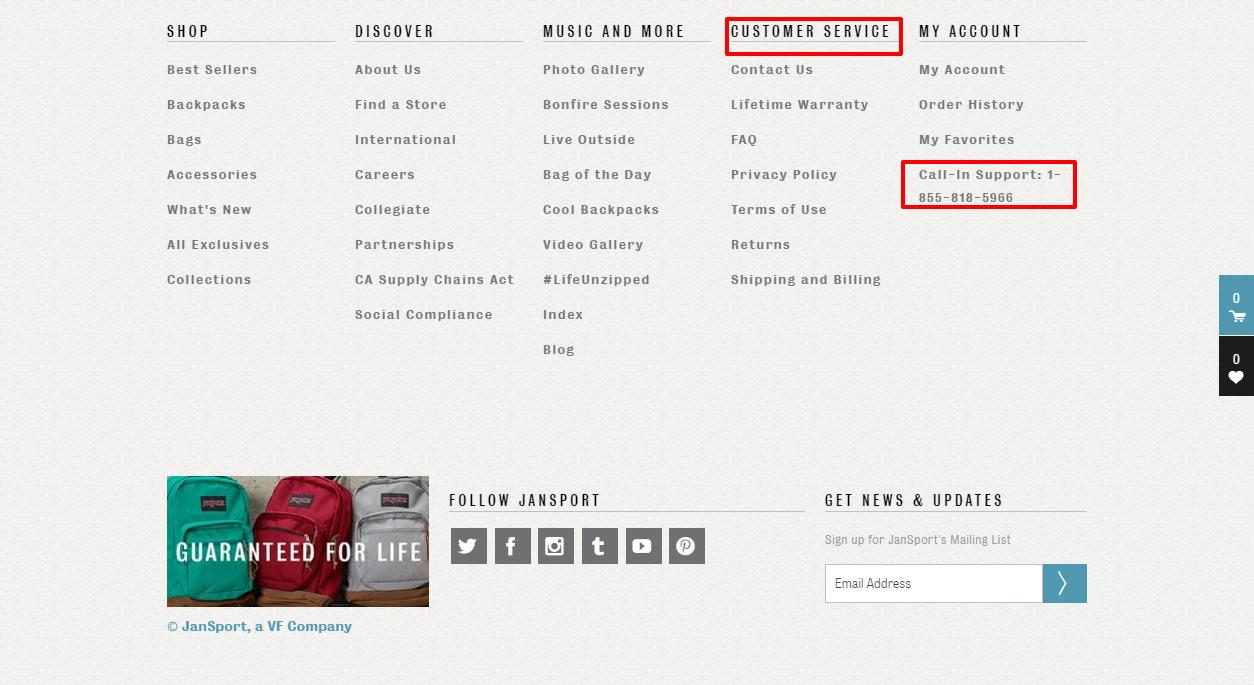
- The only contact option above the fold is “find a dealer.”
- Customer support is the fourth column of links at the footer.
- Support phone number available.
- Social media icons and links are placed at the bottom of the page.
Kathy Caprino displays a “contact” option at the top menu, followed by links to social media. At the footer, social media links receive a prime spot at the top center of the area.
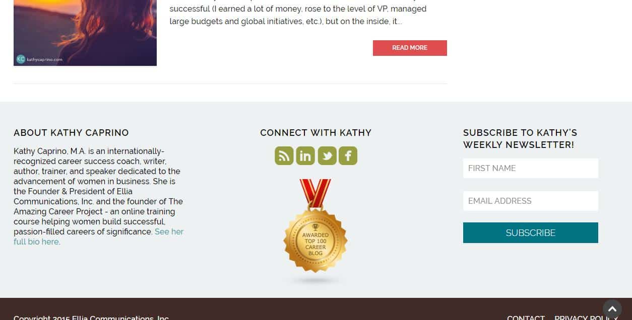
- Social media links are placed both on the top menu, above the fold, and on the footer. Caprino chooses social media as a central way of establishing contact with visitors and clients.
- Phone number available at the contact page.
- Easy to find contact information, on the page or social media.
Neo Law Group provides a link to their contact page at the top menu, above the fold. Social Media links come at the footer.
- Easy to find contact information.
- Phone number displayed on contact
DeskBeers offers a FAQs link at the top menu, above the fold, and a live chat option.
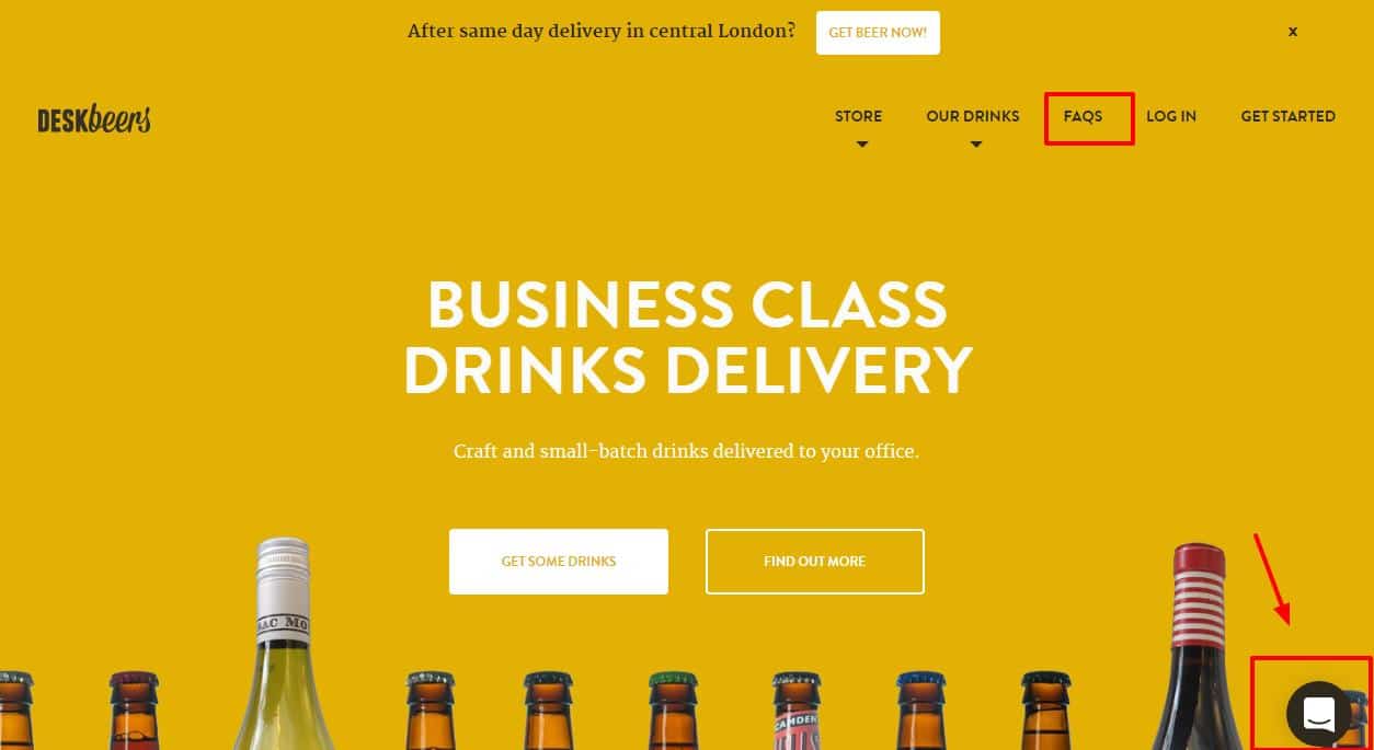
- Live chat icon fits the It is not intrusive, but it is available above the fold.
- Visitors can chat with customer service representatives, or go to theFAQs page, without the need to scroll down.
- The footer brings links to contact page and social media.
- No phone number is available.
How can you improve contact options on your homepage?
Your company’s contact information is crucial for visitors. Over 40% of visitors would leave a website that lacks contact information. Make it clear, at the above-the-fold area, how visitors might reach you. Remember, buyers will visit your website up to five times before making the first contact. It is your job to make it easy for them to communicate with you, once they feel ready to do so.
- Add a contact link on your top menu.
- Add address, phone number, and email address in the footer, as well.
- Add live chat, if you can have someone available to chat with As 83% of customers require some live support when making online transactions, live chats come in handy to address customers’ pain points and increase conversions. Visitors who chat are 2.8x more likely to convert than non-chatters.
- Design an unobtrusive live chat. 30% of visitors would leave a website because of intrusive live chat.
- Clearly state live chat and phone number hours of operation. Determine and announce visitors how long it will take you to return email inquiries.
- Add a FAQs page, once you identify your visitors’ most common concerns.
4. “Can I trust you?” “Sure, see I have already helped all these people!”
So, your visitors got acquainted with your website, found out you offer the product or service they need and asked you any questions that were troubling them. Now, both first-time and returning visitors, at interest and desire stages, will ask themselves if they can trust you.
Remember, as nice as you are, these visitors have never seen you before.To invest their hard-won money and precious time on your offers, they need proof from previous happy clients and earlier successful transactions.
As with any relationship, gaining future clients’ trust is an ongoing effort. You can only progressively attain visitor’s trust along five levels of commitment, by fulfilling lower levels first, before reaching higher ones.
By recognizing your visitors’ trust needs, assure them how many people have bought your products or hired your services. Stress how your solutions satisfied these clients. Social proof comes into play to raise credibility on your homepage.
Tortuga chose to display media references, before the footer, after pictures of their product, and the shop button.
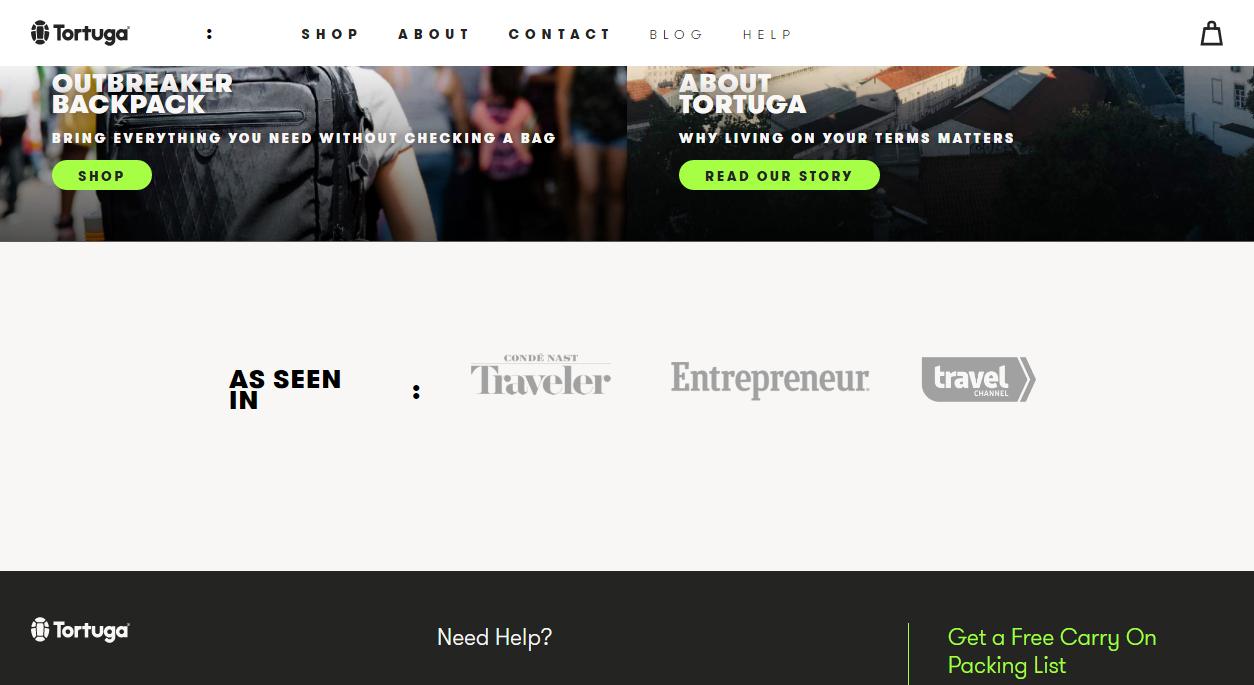
- Media references are announced by the subtitle “As seen in.”
- Darker gray logos over a light gray background help visitors identify the references.
- No testimonials and no social media mentions appear on the homepage. Reviews appear on the product
Osprey displays above the footer images shared by clients on Instagram.
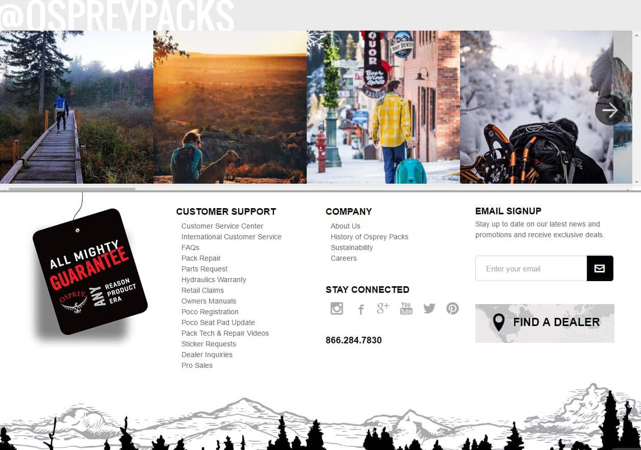
- The pictures serve as social proof, as they show clients using their packs.
- These images also help to reinforce the lifestyle associated with the brand and products.
- These photos comprise a valuable imagery because they are real, not a mockup, an arranged photoshoot session for an advertisement, or a stock picture.
JanSport has an Instagram gallery with pictures of customers carrying their bags.
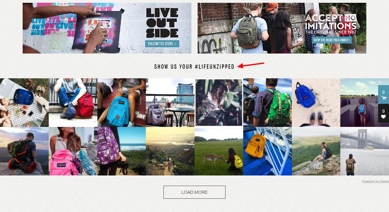
- These images reinforce the lifestyle the brand wants to associate with They even created a campaign with the hashtag life unzipped.
- The gallery demonstrates social proof of previous buyers enjoying the products.
- The gallery becomes efficient because these are real photos, not stock images, or posed photoshoot sessions.
Kathy Caprino adds three trust elements on her homepage. First, a link to her TEDx talk, followed by media references, and testimonials.
- Link to TEDx talk shows recognition of her work.
- Gray logos help visitors identify media references, announced by the subtitle “Kathy’s featured in.”
- The different background, in a darker color, makes testimonials stand out on the page.
- To increase credibility, these testimonials are accompanied by the clients’ pictures.
Neo Law Group displays a section of announcements.
- The section announces achievements of their employees/owners: awards, media features, and works as newspaper columnists.
- These announcements reinforce the recognition of these professionals as authorities.
- To increase credibility, the are accompanied by photos of the staff.
DeskBeers uses two trust elements, media references as the first element below the fold, and customers’ mentions in social media, before the footer.
- Light gray background, with darker gray logos over, helps visitors identify media features.
- No subtitle is used to announce media features.
- Social proof from customers on Twitter and Instagramis announced as “What our customers say.”
How can you improve trust on your homepage?
Several elements of design and copy build trust in a homepage. Social media mentions, media features, and testimonials stand out as trust signals, but building trust may go further.Trust elements are a crucialfeature in conversions, but they need to be used wisely. Too many of them might bring the opposite effect.
- Be careful not to over-use social proof technique.
- Power testimonials with precise questions.
- Consider additional elements to useas social proof, as case studies, client’s logos, thenumber of customers.
- Design considering the liking principle.
Answer visitors’ questions and lead their way
After assuring visitors your trustful website offers unique products and services backed by consistent customer support, it is time to lead the action stage of the customer journey. Now that your visitors have gone through the phases of awareness, interest, and desire, they feel ready to start a relationship with your company.
Align visitors’ needs to the objectives you determined for your homepage. With these requirements and goals in mind, design clear call-to-actions above the fold to fulfill the multiple purposes of your page, for different stages of the buying circle.
For extra help, find out the critical elements of every homepage in this infographic and check some tips on doing an extreme makeover on your homepage.If you are looking for design inspiration for professional services pages, do not lose your focus on conversion, and check these award-winning homepages.
You can also work on underrated but effective conversion optimization techniques and try a conversion rate audit to your homepage.


